The mySugr app provides a clear summary of your diabetes data at a glance. Get an overview of your glucose curve, trends, and Time In Range (TIR) with simple graphs to help you learn more about your diabetes. Statistics like your Glucose Management Indicator (GMI) help you understand how your therapy is working.1 Tap the Graphs icon in the tab bar of the Home screen to see different types of data:
Time in range
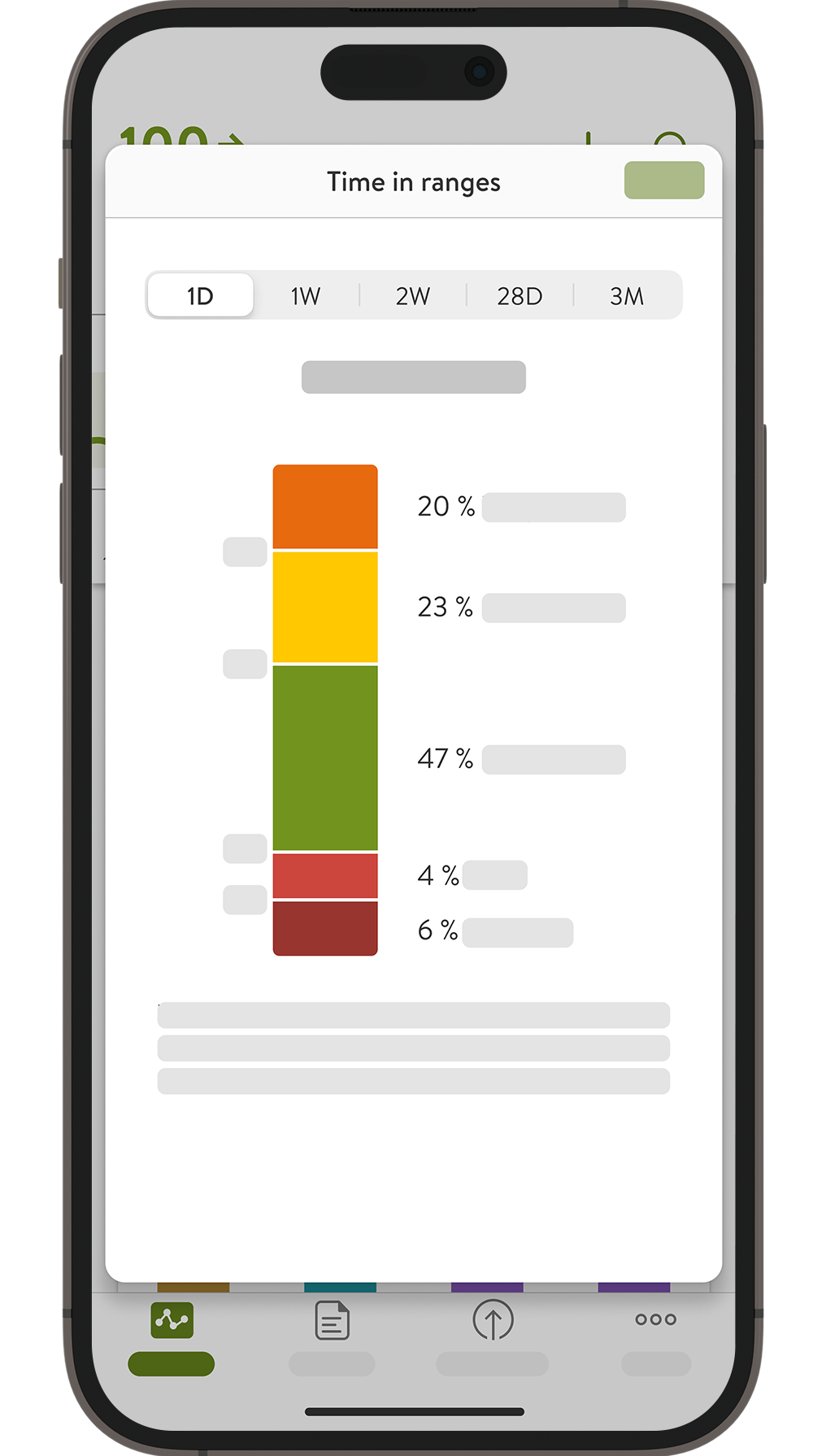
- See how much time your glucose values stayed within range, including your personal target range, over the past 7, 14, 28 or 90 days.
- The goal is to spend as much time as possible “in range” (the green area of the graph).
Statistics

- View your CGM usage and key metrics for the past 7, 14, 28 or 90 days.
- See your active CGM time, average values, and glucose management indicator (GMI).
What is GMI
The Glucose Management Indicator (GMI) is a representative number to understand your average glucose levels.1 The number is calculated from the glucose values measured by your CGM sensor over the range of time that you select at the top of this screen. It’s expressed as a number in percentage, similar to the HbA1c measurement (average 3-month glucose value). However, this may differ slightly from the laboratory value.
If you are reading the graphs on your Apple Watch, be aware that they may appear slightly shortened due to the different screen dimensions. Their schematics and values remain the same as in the mySugr app.
- Tap More to find information about the screen's content and how to use it.
- You can always refer to the User Manual in the Help section of the Menu.
Next, discover more about alarms and reminders.
References:
- Bergenstal RM, Beck RW, Close KL. Glucose management indicator (GMI): A new term for estimating A1C from continuous glucose monitoring. Diabetes Care 2018: 41:2275-2280
How helpful did you find this training?
Continue Training
Previous step
Accu-Chek Newsletter
Stay informed about diabetes
Get diabetes management tips and news delivered right to your inbox.